CMT218 Data Visualisation Case Study Sample
INTRODUCTION
The term "data visualisation" refers to a graphical representation of data that emphasises its importance. It reveals patterns and insights that might otherwise be hidden in raw data. It is a method for making data, statistics, and measures more understandable.
Excerpting from Friedman (2008):
From the above remark, we comprehend that the goal of an ideal data visualisation chart is to connect with the users by making the data presented to be analysed clearly and at the same time, induce the target audience with ideas and thoughts about the data projected. While working on different datasets, one should probably think about the many aims one may pursue, as well as the numerous ideas one could explore, and in the process, would need to follow up with certain principles and concepts, that would need to be implemented while visualising the data.
To understand better, let’s consider an instance and deduce the ideality of it.
CASE STUDY
We look at the scenario "Has Facebook Reached Its Growth Limit?" offered by Richter (2022), which shows the saturation of user growth of the popular social networking service Facebook during the last ten years, from 2011 to 2021, as well as the falling Year-on-Year user growth. In this section, we'll look at how the chart chosen for the discussion appears to fulfil the criteria and principles given down by a number of specialists in the field of data visualisation.
Now, let us look at the chart being considered for our purpose of study below.
.png)
From 2011 to 2021, we can see that while the number of monthly active users, marked in dark blue, has been steadily rising from almost 700 million in 2011, the number of monthly active users appears to have plateaued around 2900 million in 2020 and 2021. Similarly, in the case of daily active users (highlighted in light blue), while there is a continuous climb from about 400 million in 2011, the number of daily active users appears to saturate around 1900 million in 2020-2021, with a dip towards the end of 2021. Similarly, in the case of Year-over-Year growth, we can see a tendency of falling growth in the case of monthly active users, which is highlighted in orange, from about 60% in 2011 to around 5% in 2021. Year- over-Year growth of daily active users, which is highlighted in yellow, shows a similar pattern of decline.
Now we'll look at how this chart appears to be a good instance for consideration. An ideal visualisation, as previously said, should include a set of standards. Various data visualisation professionals, like Edward Tufte, Alberto Cairo, Stephen Few and others, have shared their perspectives on how to portray a data visualisation in a standard manner. We'll now combine these concepts and compare them with the case study chosen. Firstly, a chart should be chosen considering in mind, the targeted audience. As remarked by Kosslyn (2006), The usefulness of a graph can be evaluated only in the context of the type of data, the questions the designer wants the readers to answer, and the nature of the consumer of the given data representation.
This is crucial since the chart's meaning is lost if the end users are unable to comprehend the content. With regard to this case study, we all know that Facebook is a very popular social networking platform, and the recent trend observed is that users from all walks of life, particularly young people, are losing interest in using it. As a result, analysts may want to look at the statistics surrounding the decline in usage and try to deduce outcomes and look in for improvisations. This graph has been clearly depicted in such a way that the targeted audience can read it, be it, the bold header that incites a sense of curiosity to follow up on the chart's purpose, the graph picturised, the content delivered and so on. Next, the graphical representation's shape is an important factor to consider. Because there is a period of time involved in depicting the data in this scenario, a line graph would be an excellent choice for depiction and hence justified.
Graphical integrity is a key factor to be considered in case of every representation. The accuracy with which visual elements portray data is referred to as graphical integrity. Because information can vary greatly, even across related data, there is a desire and an inclination to scale data disproportionately to fit it into the available space, and this should be carefully handled. The set of six principles for graphical integrity, laid by Tufte (1983) are as follows.
? The representation of numbers, as physically measured on the surface of the graph itself, should be directly proportional to the numerical quantities represented.
? Clear, detailed and thorough labeling should be used to defeat graphical distortion and ambiguity. Write out explanations of the data on the graph itself. Label important events in the data.
? Show data variation, not design variation
? In time-series displays of money, deflated and standardized units of monetary measurement are nearly always better than nominal units.
? The number of information carrying (variable) dimensions depicted should not exceed the number of dimensions in the data. Graphics must not quote data out of context.
? Graphics must not quote data out of context
All of these facts are shown in this diagram, starting from proportional numerical quantities on both axes, with suitable labelling, variation in data observed with comparison between daily and monthly user numbers, as well as Year-on-Year growth throughout the time period. These altogether relate to the above-mentioned points. We can also see that the visuals do not quote stuff out of context because the data depicted is highly related.
According to Stephen Few's belief in the necessity of scepticism in data visualisation, questions such as why user interest is dwindling, how to remedy this and rekindle user interest, and so on may naturally arise in the thoughts of the reader. Another reason why this data representation appears to be a good one is that such depictions are effective in improvising norms and are archetypal. In such ways, this representation seems to be quite apt in choice.
However, this dataset needn’t show both the saturation of monthly and daily active users, as well as the downward trend in the users' Year-over-Year growth in a single chart, because fitting it all into a single representation might confuse some users, especially because of the dissimilar values present on the vertical axes on both sides, which make it difficult to read. It would have been preferable if it was atleast mentioned textually as to which values along the vertical axes depict which values.
CONCLUSION
In light of the above, we may conclude that the data visualisation that has been chosen, meets all the objectives of a conventional data visualisation presentation. In general, one can achieve better results by using a standardised method of data visualisation. As a result, it's critical to adhere to such guidelines and work at all times.
Solution
Introduction
The graphical display of various types of information or data is known as data visualization. Data visualization tools make it possible to recognise and comprehend ongoing trends, patterns, styles, and variances in information or data by utilizing visual components like graphs, charts, maps, photographs, and more. University Assignment Help, Simply put, it offers insights and obvious identification that may be obscured or unnoticed in raw data. It is one of the techniques for improving the appropriateness and comprehension of data or measurements.
According to Dibia and Demiralp (2019),
Because of the expressive and advanced syntax and complicated graphics used in statistics, measurements, and data visualization, it can be rather tough and challenging for consumers to comprehend effective and critical visualization (Dibia and Demiralp, 2019). But certain high-level, sophisticated, and specialized visualization tools require users to manually pick and choose amongst data attributes and choose which alteration or transformation has to be applied. details of the mapping between the variables used for visual encoding and the raw and alternate attributes or allocations.
The purpose of an ideal data visualization chart may be inferred from the aforementioned statement that it is to effectively communicate data in a way that is clear and aesthetically appealing. Users should be able to immediately understand the main ideas, patterns, and trends in the data. It must be able to display the data in a form that makes it simple to understand and analyze. Additionally, it must be able to draw attention to any anomalies or outliers in the data. In addition to being functional, the chart should also be aesthetically beautiful and have a clear design and structure. Along with inspiring the audience with original concepts and ideas, data visualization should also use predicted data to support its claims. When working in a separate database that can be further investigated, one should keep several goals and concepts in mind. While visualizing data, there are a number of guidelines and standards that must be followed.
To understand the importance and ideality of data visualization, one case study will be discussed thoroughly on "Anti-satellite testing in the space".
Case Study
Anti-satellite (ASAT) testing refers to the testing and development of weapons that can destroy or disable satellites in space. The first ASAT test was conducted by the US in 1959. Since then, over 70 ASAT tests have been conducted by various countries, with 16 of them being successful. This visual representation states the ground of the study regarding the Anti-satellite programs happening in the world from the very beginning.
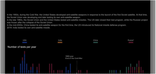
Figure 1: Anti-satellite testing in space
(Source: Provided)
Further, the graphical representation states that during the Cold War, the US and the Soviet Union were engaged in a space race, with both countries developing anti-satellite weapons in response to the launch of each other's satellites. The US developed its first ASAT weapon, the Bold Orion, in the 1960s, while the Soviet Union developed its own ASAT weapon, the Istrebitel Sputnikov (satellite killer), in the 1970s. The development of these weapons led to the first ASAT tests by both countries.
In 1985, the US tested its ASAT weapon by launching a missile from an F-15 fighter jet, which hit and destroyed a target satellite in orbit (Bommakanti, 2019). The Soviet Union responded with its own ASAT test in 1987, where it launched a missile from the ground that hit a target satellite in orbit. These tests highlighted the potential of ASAT weapons to threaten satellites in space and the need for international regulations to prevent the weaponization of space.
In response to China's ASAT test, the US introduced its National Missile Defense program, which aimed to develop a missile defense system capable of intercepting and destroying incoming ballistic missiles, including those launched from space. The US has also been developing a new generation of ASAT weapons, including the Airborne Laser program, which aims to use a laser mounted on a modified Boeing 747 to destroy satellites in orbit.
From the graphical representation it can be stated that in 2019, India conducted its first successful ASAT test, joining the US, Russia, and China as the only countries with this capability (Set, 2019). India's test was aimed at demonstrating its space defense capabilities and was not directed against any particular country. However, the test generated thousands of pieces of space debris, which could pose a threat to other satellites and spacecraft in orbit.
The increase in ASAT testing and the weaponization of space has raised concerns about the security and stability of space. Space is a vital domain for military, economic, and scientific activities, and any disruption in its functioning could have significant consequences (Unal, 2019). ASAT weapons pose a threat to both military and civilian satellites, which are used for communication, navigation, weather monitoring, and other purposes. Disrupting these satellites could have severe consequences for national security, public safety, and economic activities.
There have been calls for an international agreement to regulate ASAT testing and the deployment of ASAT weapons. The 1967 Outer Space Treaty, signed by over 100 countries, prohibits the deployment of nuclear weapons in space but does not specifically address ASAT weapons. The treaty also requires countries to avoid harmful interference with the peaceful activities of other countries in space.
Graphical integrity is one of the most important things to take into consideration when it comes to any form of depiction. The art of accurately and consistently communicating the intended information using graphic elements is known as graphic integrity (Kolesnikov et al., 2020). This covers font, color, layout, and other design components. In order to keep a brand credible and trustworthy, as well as to make sure that the message is accurately delivered to the target audience, graphic integrity is crucial. The following are the six graphical integrity principles,
? When presenting data in graphs, consistency is key. For accurate information comparison, graphs should use the same scale and size.
? The data should be carefully examined, and any details that may be crucial to comprehending the data should be magnified and clearly identified.
? Without inflating or misrepresenting the data, graphs should display it truthfully.
? To avoid ambiguity or misunderstandings, proportions should be appropriately expressed.
? For the reader to comprehend the information being provided, axes should be clearly labeled.
? Instead of drawing attention away from the data being given, colors and textures should be used to emphasize significant parts.
Conclusion
In order to achieve the ideal goal, the data visualization that has been selected to accompany the case study is adequate. Simply put, having a data representation that is sufficiently standardized can result in superior outputs. Yet, upholding all rules simultaneously is significantly more challenging.
Reference
Dibia, V. and Demiralp, Ç., 2019. Data2vis: Automatic generation of data visualizations using sequence-to-sequence recurrent neural networks. IEEE computer graphics and applications, 39(5), pp.33-46.
Kolesnikov, A., Beyer, L., Zhai, X., Puigcerver, J., Yung, J., Gelly, S. and Houlsby, N., 2020. Big transfer (bit): General visual representation learning. In Computer Vision–ECCV 2020: 16th European Conference, Glasgow, UK, August 23–28, 2020, Proceedings, Part V 16 (pp. 491-507). Springer International Publishing.
Bommakanti, K., 2019. Soft Kill’or ‘Hard Kill’? The Requirements for India’s Space and Counter-Space Capabilities. ORF Occasional Paper, (224).
Set, S., 2019. India’s Space Power: Revisiting the Anti-Satellite Test. Carnegie India. September, 6.
Unal, B., 2019. Cybersecurity of NATO's Space-based Strategic Assets. Chatham House. The Royal Institute of International Affairs.
Fill the form to continue reading
Would you like to schedule a callback?
Send us a message and we will get back to you


Highlights
Earn While You Learn With Us
Confidentiality Agreement
Money Back Guarantee
Live Expert Sessions
550+ Ph.D Experts
21 Step Quality Check
100% Quality
24*7 Live Help
On Time Delivery
Plagiarism-Free

 81 Isla Avenue Glenroy, Mel, VIC, 3046 AU